

Speed Signal AI is screening and analytics software, not a broker-dealer or investment adviser. Scores, phases, and screening results are data outputs and research candidates, not investment advice, recommendations, trading signals, or a buy list. Always do your own research.
What you see
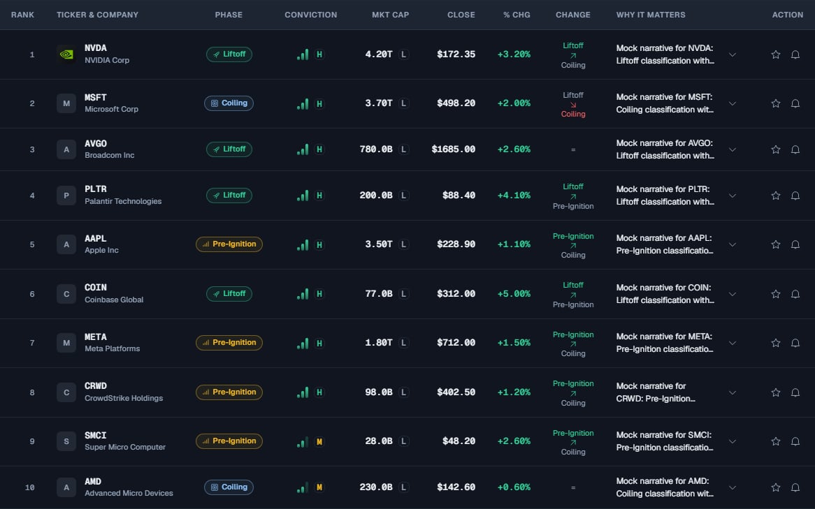
- Market Snapshot: market context (Bullish, Neutral, Bearish, or Unknown) based on SPY relative to its 50-session average and that average’s slope, plus four transition counts: New Liftoffs, Pre-Ignition Upgrades, New Coiling, and Conviction Upgrades. Their deltas compare each count with the prior session. Each card opens the Signal Board with the matching tickers; unavailable comparisons are not shown as zero.
- Top 10 Daily Setups: the session’s highest-ranked names in one table, with a Filters panel to narrow them.
- Signal Story: a short narrative summary of the day.
- Sector Strength: which sectors are leading and lagging in the day’s scan.
- Recent Setups: names that recently moved into a setup, tracked by their price change since then.
Scores update once per day, after the US market closes. Everything you see reflects the most recent completed trading session, not live intraday prices. The only live element is the candlestick chart on a ticker’s detail page.
Read the Market Snapshot
The Market Snapshot sets the backdrop. The regime card summarizes which way the day’s scan is leaning, from the balance of phases in today’s results, and lands on Bullish, Neutral, or Bearish. The four KPIs then count what changed in the scan today, each with a day-over-day delta (a percentage change versus the prior session) so you can see the direction of travel. Selecting a KPI jumps into the Signal Board pre-filtered to those names, with a banner showing which Daily Brief group you came from.A day-over-day delta describes what already happened at the last close. It is shown as a percentage change versus the prior session (for example, ”▲ +25%” beside New Liftoffs means that count rose about 25% from the prior session). It is not a forecast.
Filter the Top 10 Daily Setups
Why It Matters shows a compact preview. Select the arrow to read the full explanation in a centered area below its data, then select it again to close. Hover does not expand it. While open, the preview is hidden without moving the columns. If the explanation would fall outside the screen, the dashboard smoothly scrolls only enough to reveal it; otherwise it stays still. Mouse-wheel and trackpad scrolling remain native. The data row stays compact, and the explanation uses a comfortable reading width. On mobile it expands inside the card below its data. Enter or Space works on the arrow; clicking the explanation does not open Ticker Detail. Expanding does not request a new AI analysis. Select a setup row or its logo, ticker or company to open Ticker Detail. A focused row also opens with Enter or Space. The star, alert button and narrative pin keep their own actions; there is no separate view icon.1
Open the Daily Brief
It is the default view. If you are elsewhere, select Daily Brief in the top navigation (or press 1).
2
Open the Filters panel
On the Top 10 Daily Setups table, select Filters to narrow the list by Phase (Coiling, Pre-Ignition, Liftoff), market cap (Small/Mid vs Large), how recently a name changed phase, and whether it is still below its trigger.
3
Go deeper in the Signal Board
Select View all setups to open the full Signal Board, where you can sort, apply the themed chips, and open individual tickers.
Read the Sector Strength card
The Sector Strength card shows a Strong, Moderate or Weak badge for setup participation (In setup), a sparkline of its average score across up to five completed sessions (5-day trend), and its sector trend flag (Tailwind). Tailwind indicates whether the sector ETF is above its 50-session average, based on the majority of known ticker flags. A dash means the required data is unavailable or tied. The ticker count appears below each sector name; at least 20 tickers are required to appear. Select the information icon for definitions, or select a sector row to open that sector in the Signal Board. These are screening measurements, not price returns or predictions.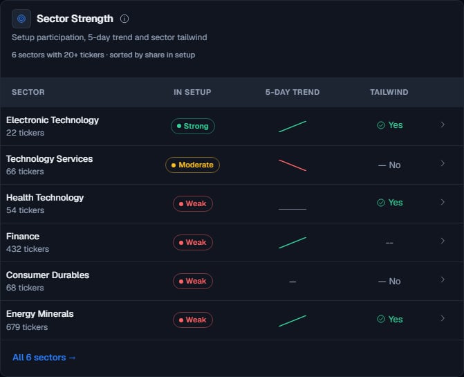
This example uses simulated data.
Read the Recent Setups card
The Recent Setups card lists names that moved into a setup recently and tracks how their price has behaved since then. It is a look back at how earlier setups have played out, not a prompt to act on any of them. Choose 5, 10, 15, or 20 completed market sessions to select when the setup began. The card shows up to six positive changes, largest first, from the full eligible group in that window. It does not just reorder the most recent names. The same names can lead more than one window. Change is the price change from the setup-start close to the latest close for an active cycle, or to the first non-setup close for a closed cycle. The selector changes the group being compared, not the calculation into a rolling return. Zero and negative changes are excluded; a small positive change can appear as <0.1%. These counts describe a filtered selection, not overall performance. Each row shows the company logo, ticker and name. The Change heading and percentages share a centered column. Selecting the row opens Ticker Detail.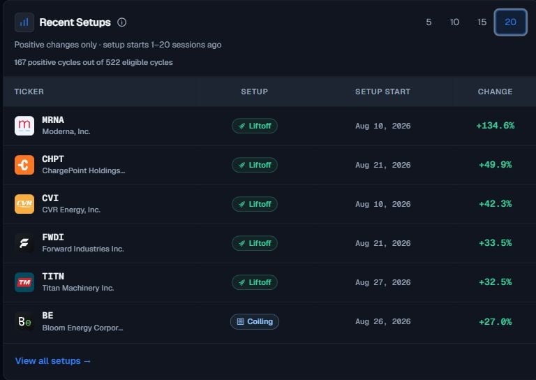
The Pro email edition
The emailed Daily Brief is a separate, compact edition, not a copy of the App’s Top10. It includes market context, one Setup of the day, additional candidates by phase, sector readings, and a comparison of the previous edition’s names with their current phases. Email candidates must have a strictly positive price change in the completed session, with up to three Liftoff, three Pre-Ignition, and two Coiling names. These are ceilings: a quiet session can have fewer or no candidates. The App’s Top10 does not adopt this email-only positive-change filter. The highest-scoring eligible Liftoff is featured first; if none qualifies, the highest-scoring eligible name in another phase is used. Your email market-cap filter applies before selection. The previous-edition comparison describes held phases, upgrades and drops, not returns. A negative daily price change alone does not mean a name lost its phase. Manage delivery and the market-cap filter in Settings → Email briefs. The email uses a light editorial layout regardless of the App theme, with one link button to the full Daily Brief. Learn about the Weekly Brief.Limits & common mistakes
- The Daily Brief reflects one completed session. The counts and deltas describe the most recent close, not live intraday movement.
- A day-over-day delta is not a forecast. Each KPI shows a percentage change versus the prior session (for example, ”▲ +25%” beside New Liftoffs); it says nothing about what happens next.
- The Signal Story is a plain-language recap, not a prediction. It summarizes the day’s scan; it does not tell you what to do with any name.
- Empty or quiet sections are normal. On a slow session, some counts may be low or a card may hold few names. That is a description of the market, not an error.
Next steps
Signal Board
Explore and filter the full list the Daily Brief opens into.
Phases & Conviction
What Coiling, Pre-Ignition, Liftoff, and Conviction levels mean.
Set up Alerts
Get notified when these groups change, without checking manually.